
The Digital Outcomes Of My Cropped Expressive Marks - Previously Photographed.
- Oct 24, 2016
- 3 min read


Aim.
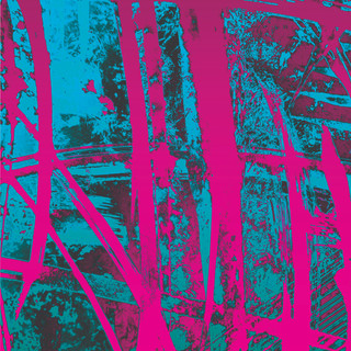
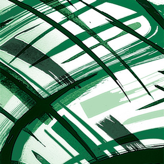
My aim when photographing these cropped sections of work previously was to focus my attention on the areas of marks that I felt flowed and interacted best. I determined this by looking at how each of the marks interacted and took into account dissection, layering, negative space and also how each mark contrasted one another. With this in mind I experimented and developed them to the points shown above.


Therefore the images above show a further progression of this intention but I've blended it with my interest of colour and my preference for vibrancy.
Layering.
I wanted to make it visually clear that I was thinking just as much about my use of expressive marks as I was about the negative space that I was leaving behind. Therefore when editing each image in Photoshop I paid close attention to keeping this aspect included. I started by changing the hue and saturation of the overall pieces in a way that would bring the marks to the foreground whilst also developing and enhancing the negative space into a colour background. By doing this I feel it allowed both grounds to be present and subsequently be seen to work together for a more overall pleasing composition.
As a result of introducing Vinyl Tape into my other studio practise I wanted to somehow show this process within my digital work also. I decided the best way of doing this was to add a new layer on top of some of the images to allow for an overlay of repetitive line formations. This use of repetitive dissection was then blended with the initial image layer to allow each of the images to visually communicate and express the repetitive process involved when repeatedly applying strips of tape onto an MDF Board. Each line of dissection is a subtle representation of how each strip of Tape can change the overall composition based on placement and as a result divides up the overall composition.


Colour.
Throughout my working practise I always focus my attention on showing each piece of work in vibrant colours. I personally like to make pieces of work that demand yours attention when placed in a white walled gallery setting. This creative aim of mine is what drove me to explore the use of colour vibrancy within these images and I tried to take inspiration from various other visual styles I'm interested in. This was a way to gain an idea of which colours have worked well for other artists in terms of contrast . These styles included Japanese Calligraphy, Gerhard Richter's oil paintings and Jim Lambie's striped floor installations. By looking at this group of artists' work my intention was to look at a range of visual styles and then subtly express elements from each style within my own pieces and I chose to do so in the form of:-
Single coloured marks with contrasting backgrounds - reference to the way Japanese calligraphy strokes' contrast their background.
Colour Gradients - reference to how Gerhard Richter using squeegees to drag paint from one side of the canvas to the other creating blends of colour that range across the surface and vibrancy.
Repetitive use of Coloured Lines in the form of Horizontal Stripes, Squares and Circular Rings - reference to the repetitive process of using Vinyl Tape to create surface designs. This is used by both myself and Jim Lambie and the process involves using various coloured tape with points of dissection to allow a change in stripe direction.


Comments